← Works
Bonzon Studio
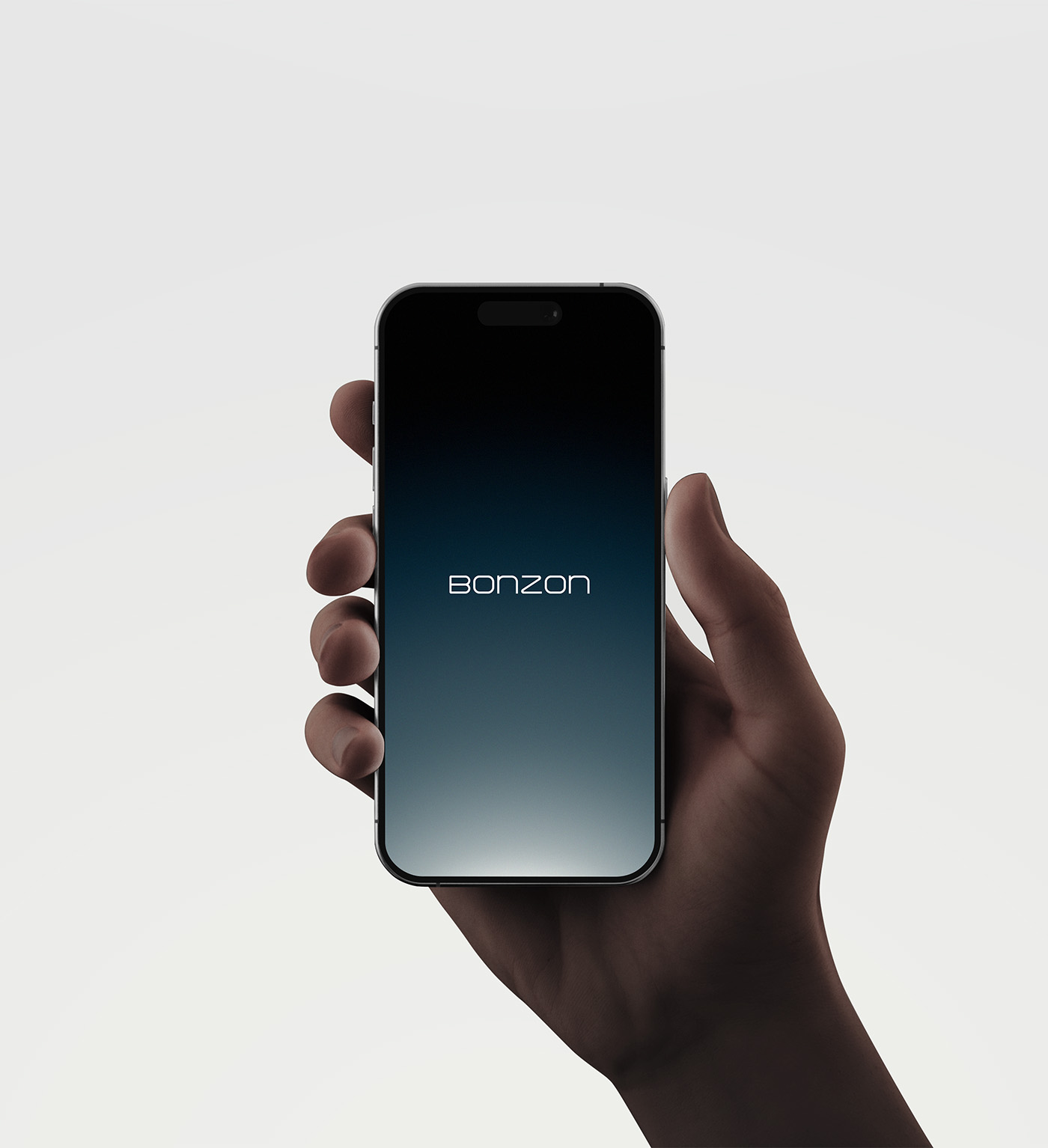
Dots to Line. Line to Aligned. Our own studio identity: a custom wordmark and a restrained system built on structure and clarity.

The Idea
Dots to Line. Line to Aligned.
It all begins with scattered dots. Tracing each brand to its origin, design weaves as a line to bridge elements and shape the future.
The identity is a dedication to establishing order amidst chaos, refining diverse imagery into one cohesive visual flow.

The System
Clarity in the steady.
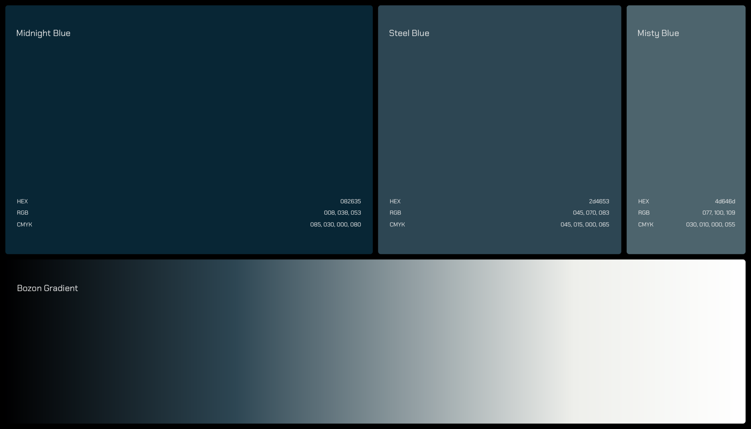
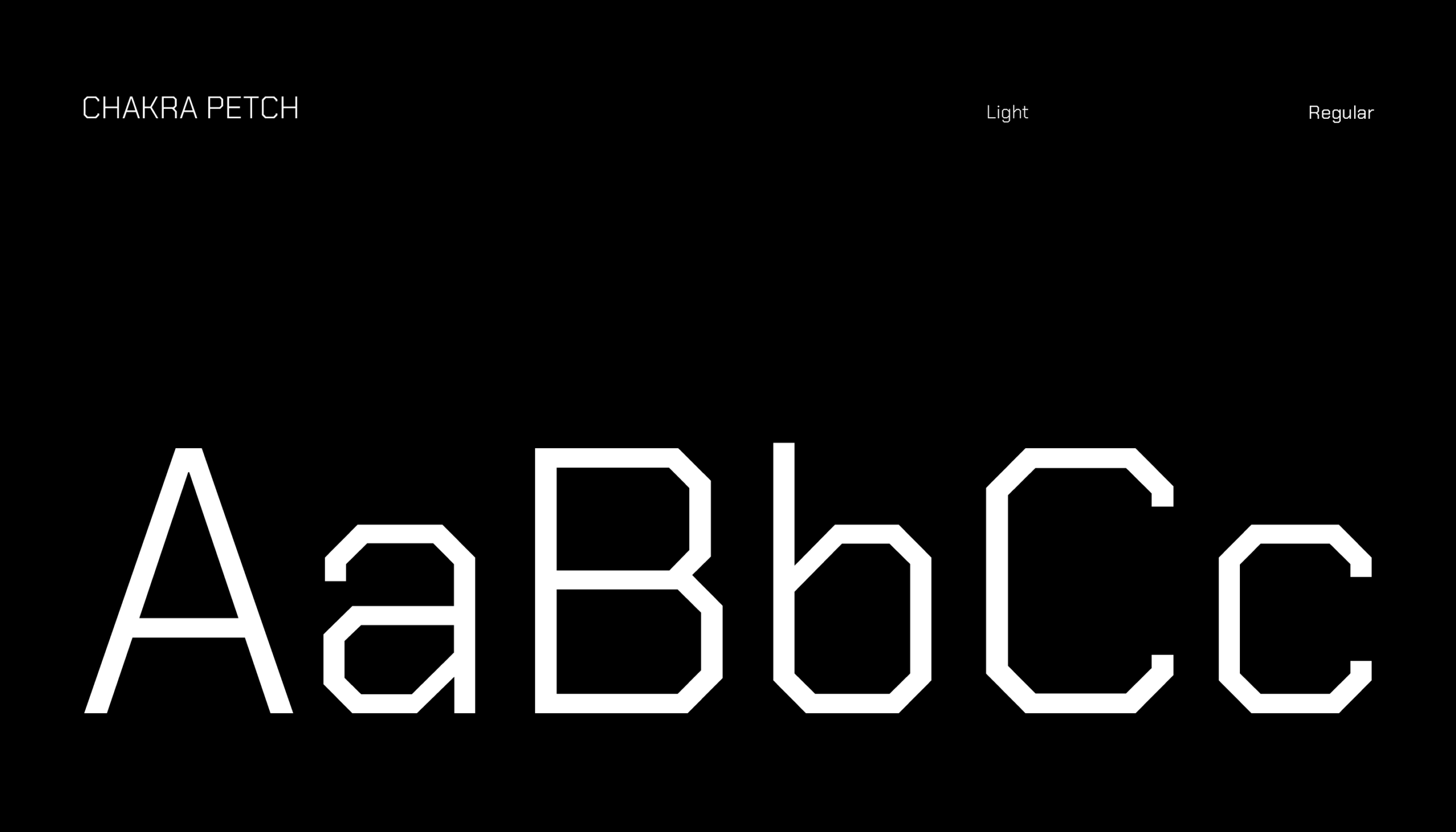
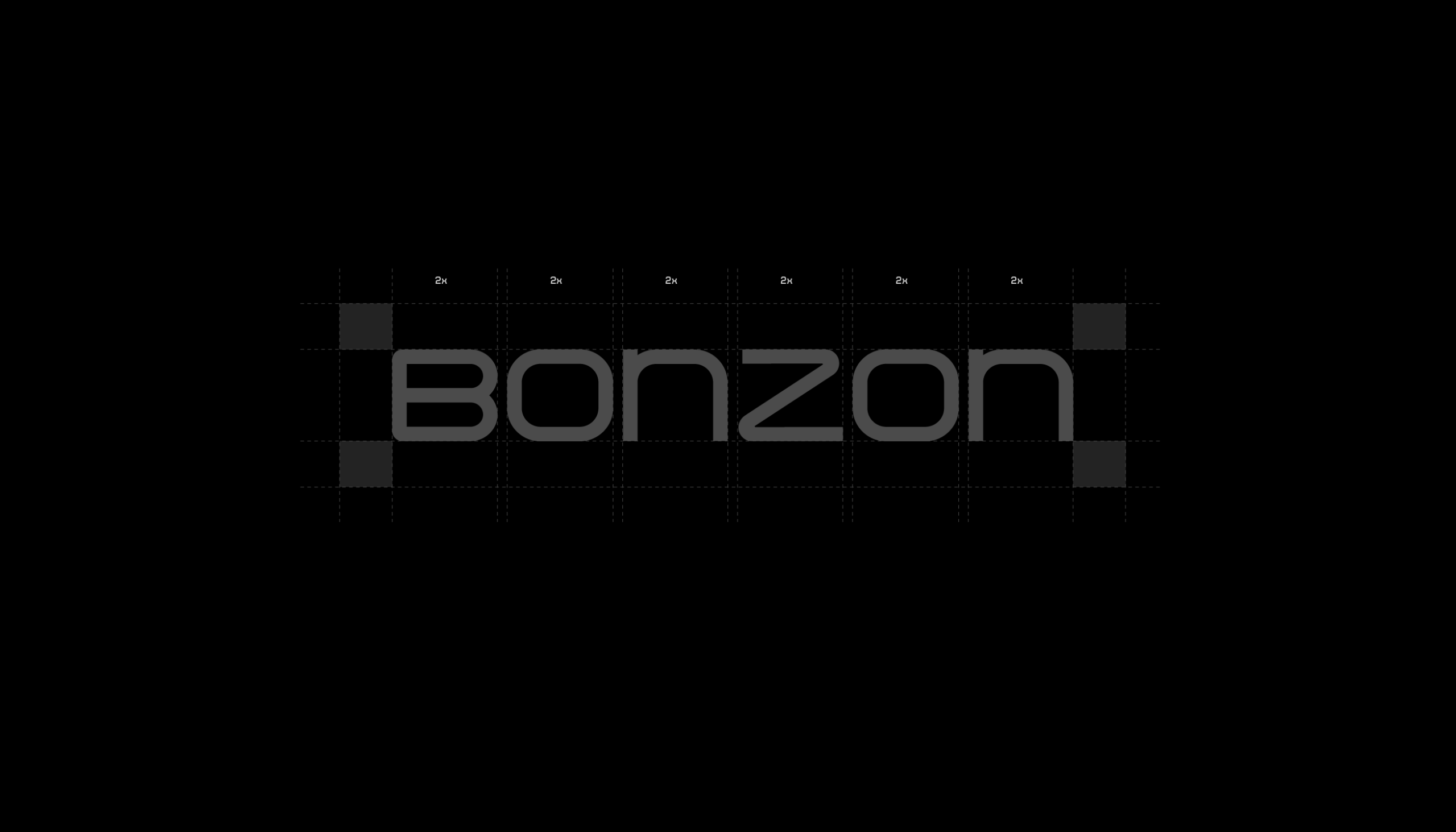
Embracing purity, Bonzon finds clarity in the steady and modern aesthetics in the restrained. Typography, colour and grid work as one structure, so every application feels like the same voice.
Design is not merely a visual output, but a close observation of the essence within.